Tuesday, March 5, 2013

Reasearch on Photographer


Photographer: Annie Leibovitz


Annie Leibovitz is a well known photographer, known for her strong and colourful photos. Her photos are usually of celebrities such as the ones you see below. Her use of light always highlights the romantic side of things, and the celebrity factor is always present. 

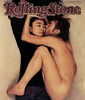
She worked for the Rolling Stone magazine and later she worked for Vanity Fair magazine. This photo of John Lennon and Yoko Ono was the front cover for the Rolling Stone magazine. When I look at it, it makes me think that Annie Leibovitz was ahead of her time. The photo is very strong and slightly abstract too...


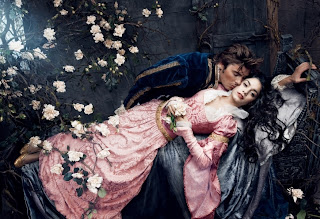
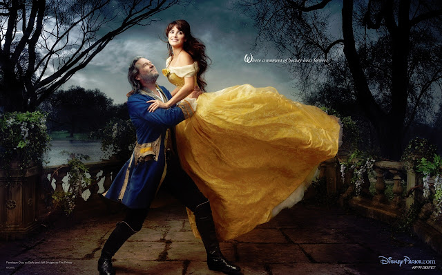
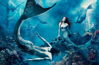
More recently, she made a compiliation of photos called the "Disney Dream Portraits". She used celebrities for the different characters. My favorite is the one of Penelope Cruz as Belle, from Beauty and the Beast. Again, you can see the way Leibovitz uses light to create a romantic magicall (almost too perfect) scene.

Friday, February 8, 2013

Lino-Print

We made another print. This time it had to be a self-portrait.
This is the product of a somewhat long process....


And this is how I did it:

Original Picture

Photoshopped Picture


We carved the picture out on a linolium, carving out the white part of the picture.


 ... I applied ink...


 ... and printed it onto paper. SIMPLES! 


The Iceberg/Glacier Project

For the past week, we've been taking advantage of the snow and ice. Our goal was to take pictures that could create the illusion of glaciers or icebergs. Here are two of mine...

I think that this picture looks like it could have been taken from a plane. I took this picture from a normal distance - that is, while I was standing relatively straight.

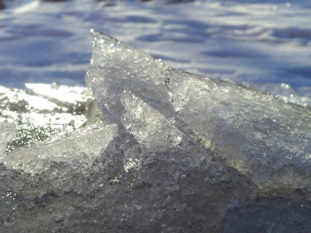
 I like this picture a lot. It's quite dynamic. This was a close up of a piece of ice sticking out of the ground. But I think it could pass as an iceberg...


Our next task was to create the same illusion using anything but snow and ice. We could use anything from bubble-wrap, to plain paper, to torches. Here are a couple of mine.

Materials used: white baking paper, torch...

 Materials used: white baking paper, one normal torch, one torch covered with peach coloured tissue paper, blue plasic sheet...


Next we had to make some collages of our "home-made" illusions, and the natural ones we had created outside. This is mine...
I had to adjust the two pictures I used a bit so that they harmonize. I used Photoshop for this of course. I adjusted the Hue/Saturation, the Colour Balance, and the Brightness/Contrast.

Here are the two original pictures I used:


Thursday, February 7, 2013

5 Highlights from Autumn Term

We were asked to pick 5 of our favorite photos from last term, and these are the ones I picked. I've written why I like these pictures particularly.

I'm not quite sure how to describe the composition in this picture... it has a nice curve going through the middle, because of the reflections in the water, and yet it's quite square, and there are many straight lines. I like this picture because of the contrast of light and dark, the blue sky reflected in the water, and the orange lights, against the blue...

This picture is very abstract, and that's what I like about it. I would say that this has a circular composition. As far as I can see, there are no straight lines... just a natural flow of shapes and colours.

 This has a triangular composition. The trees create a diagonal line, creating a triangular space against the light. I like this picture because the light has created beautiful colours.

 I like to think that this has a circular composition. The tree is responsible for that. But there are many straight lines, and this creates a nice contrast. Another contrast is the nature against the man-made wall. This picture wouldnt have the same effect if the tree was at the center of it. 

 I've taken many pictures like this. But, whereas most of the other ones are quit square, this one is more triangular. I took this picture because I was fascinated with the light touching the tree-tops. But looking at it now, the moon plays a big part. Without it, the picture would seem almost meaningless. It's almost as if the moon is the centerpiece of the picture...

Tuesday, February 5, 2013

Fantastic Paint!

I was in my art class the other day when I had to wash up some pallets of paint and some paintbrushes... the result in the sink was quite inspiring. Abstract, but inspiring...


A Moment With The Camera...

The other day, I was waiting for the bus in the freezing cold... and to take my mind of it, I decided to make use of my surroundings... It's amazing what you can find in a bus stop. Here are three of the pictures I took.